Digital Platform to connect Commercial Industry Professionals and Business
RealGraph, a digital platform launched in 2017, connects commercial industry real estate professionals and businesses.
Lead Product Designer
My Role
UX/UI Design System Product Strategy
Responsibilities
Observer Holdings LLC
Company
Real Estate
Industry
Project Objectives
As a seasoned UX/UI Designer, I joined the team to assist with all phases of product design, from conceptualizing broad ideas and giving design direction to creating wireframes and prototypes. My background in data visualization and dashboards was a valuable addition because this product is a dashboard-based platform.
• Tasks & Deliverables
- - Design review
- - Brainstorm solutions
- - User journeys
- - Wireframes
Problem Statement
The current process for commercial industry real estate professionals to connect and collaborate with potential business clients is inefficient and time-consuming. Finding and qualifying potential clients requires extensive research and networking efforts, which can be a significant barrier to entry for new professionals in the industry. Additionally, there is a lack of transparency and standardization in the process, making it difficult for both parties to find and connect with the right match for their needs. This leads to missed opportunities, wasted resources, and a general lack of efficiency in the commercial real estate industry. Realgraph aims to solve these problems by creating a digital platform that connects commercial industry real estate professionals and business clients in a transparent and efficient manner, streamlining the process and providing valuable data and insights to all parties involved.
The Starting Point
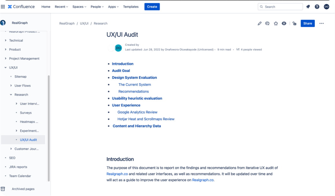
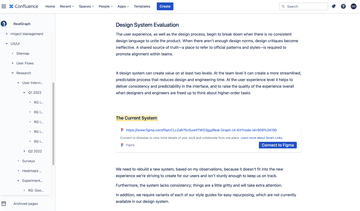
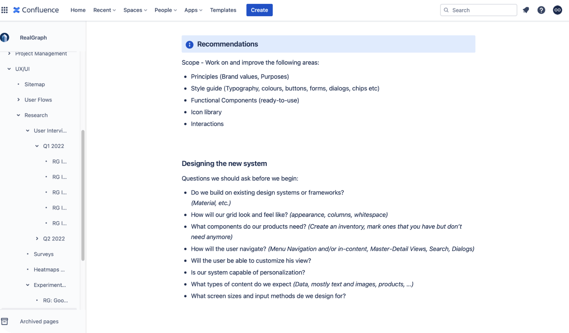
Objectives
- To understand the needs and goals of commercial real estate professionals and businesses when searching for properties.
- To identify pain points and areas for improvement in the current process of connecting businesses with suitable real estate properties.
- To gather insights on how Realgraph can provide a more efficient and effective way for businesses to connect with real estate professionals and find properties that meet their needs.
Participants
- Commercial real estate professionals, including brokers, agents, and managers.
- Business owners or representatives looking for commercial real estate properties.
Methodologies
- Online surveys to collect quantitative data on user demographics, preferences, and behaviors.
- In-depth interviews with a subset of participants to gather qualitative feedback on their experience with the current process and their needs and expectations for a platform like Realgraph.
- Usability testing of Realgraph prototypes to gather feedback on the features, functionality, and user experience of the platform.
Key Findings
- Users want a comprehensive database: One of the most significant findings from the research is that users place a high value on a comprehensive database of commercial real estate properties. They emphasized the need for accurate and up-to-date information on ownership, tenants, lease terms, and other relevant details. This information should be easily searchable and filterable, allowing users to quickly find the properties that meet their requirements.
- Users value efficiency and time savings: Efficiency and time savings were also identified as key user needs. Commercial real estate professionals often work under tight deadlines and need to be able to quickly find and connect with potential clients and partners. Users want a platform that is easy to navigate, provides relevant search results, and facilitates efficient communication.
- Trust and credibility are important: Users emphasized the importance of trust and credibility in commercial real estate transactions. They want to be able to trust the information and connections provided by the platform. Users value transparency and accuracy in data and appreciate features such as verified listings and user reviews.
- Collaboration and networking are desired: Finally, users expressed a strong interest in features that facilitate collaboration and networking among real estate professionals. They want to be able to easily connect with potential partners, share information, and collaborate on deals.
Implications
The user research analysis highlights the need for Realgraph to provide a comprehensive, efficient, trustworthy platform that enables collaboration and networking among commercial real estate professionals.
Realgraph needs to ensure that the platform provides accurate and up-to-date information on commercial real estate properties, while also facilitating efficient communication and collaboration. Trust and credibility are essential for the platform, which should include features such as verified listings and user reviews.
General Process (Establishing the function of the design)
In order to achieve these objectives, I worked with my product manager to create a roadmap explaining how I will concentrate and contribute to the team as a solo designer. We worked with business executives to ensure the roadmap matched expectations in order to make everyone feel like they were a part of the plan. I then set about implementing my idea.
I divided the plan into five sections:
- Design must be established in a transparent manner in order to convey design processes and results and to promote design thinking inside Realgraph.
- To stay up with the current product, establish Realgraph design requirements. Collaborate with stakeholders to define and agree on "what is good design."
- Extend design by evolving current features in accordance with the new requirements. Work on the backlog of current features to bring them up to speed with the newly specified criteria.
- Perfectly align with ongoing engineering and product goals. After updating the existing features, work with design to interact with engineering and product management on new additions.
- Consider future product enhancements and initiatives. Extend your design contributions by sharing concepts and research early on.
Realgraph.co Design System Refresh
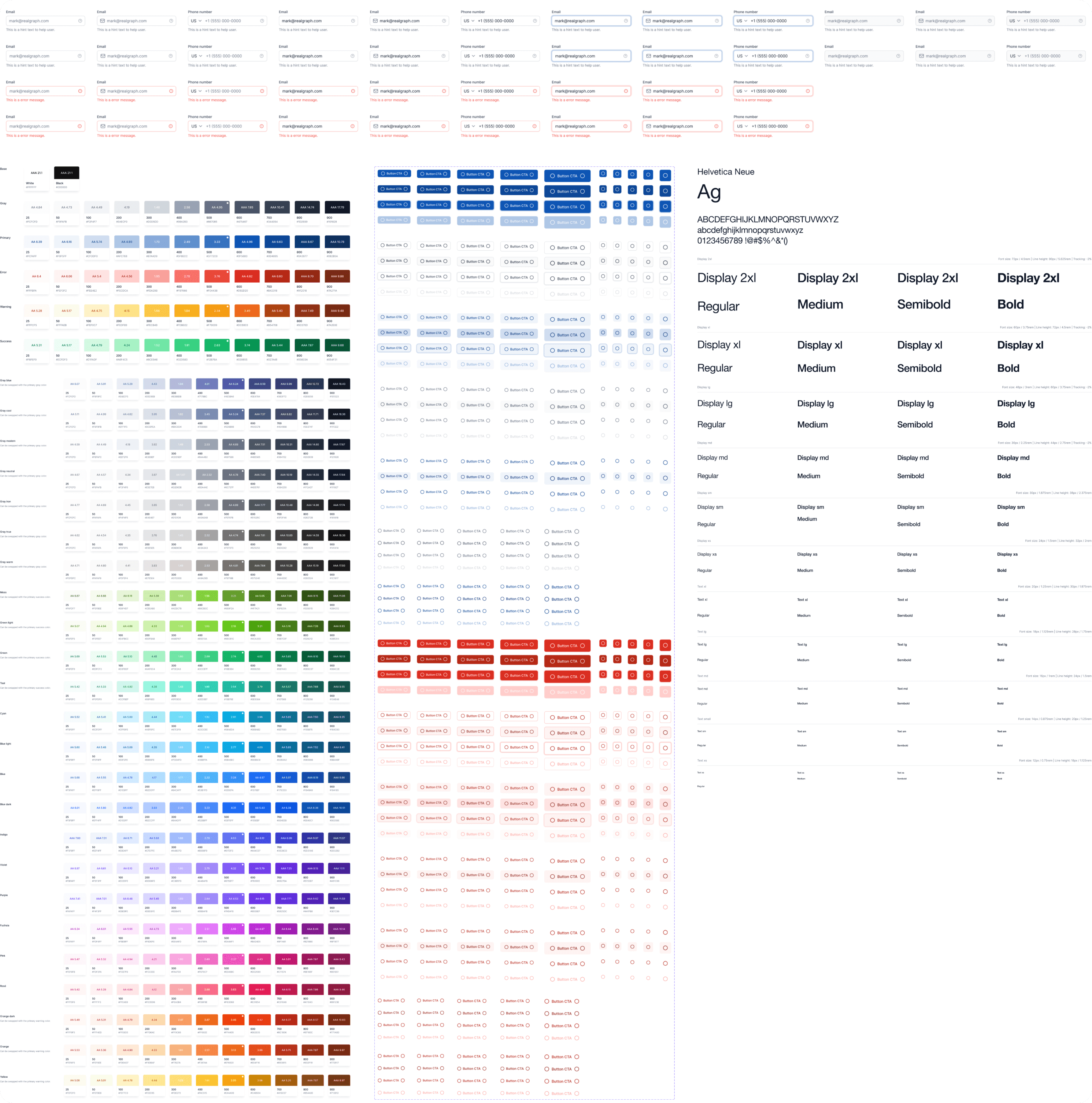
Because we're trying to update the company's old brand, I set out to construct a new design system after determining the function of design.
The goal was to add some polish and guiding principles that would better fit where the company was at rather than completely redesign the old brand.
To ensure consistency across the brand, new color schemes, text fields, button styles, and typeface styles were created as a result. In order to increase user satisfaction and interest in the brand, I also created new widgets and components.
1. Data Cards Improvement
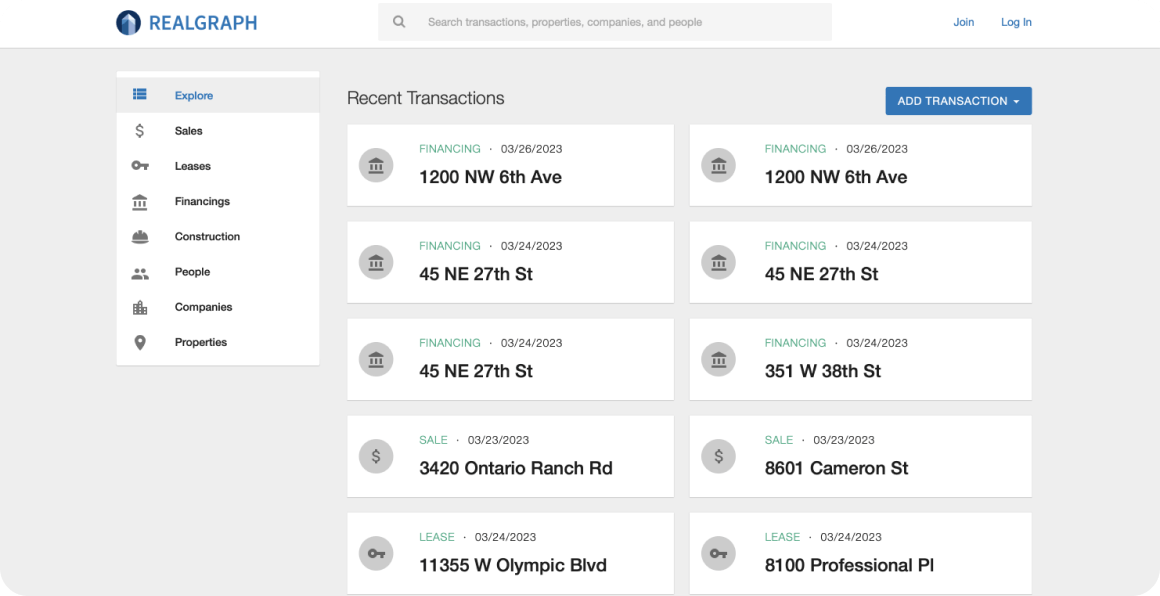
Existing Card Design
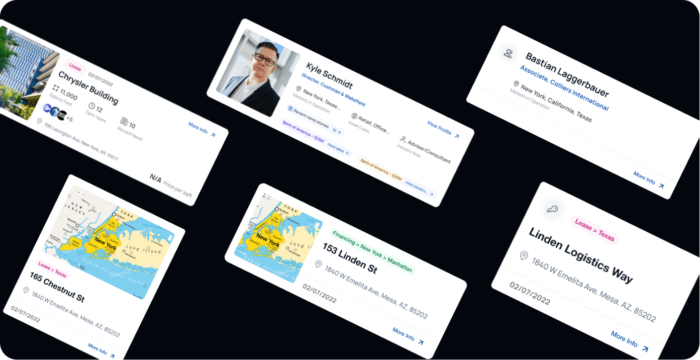
Refined Card Design
Goal
Scope
Here are some solutions I explored to improve the data cards:
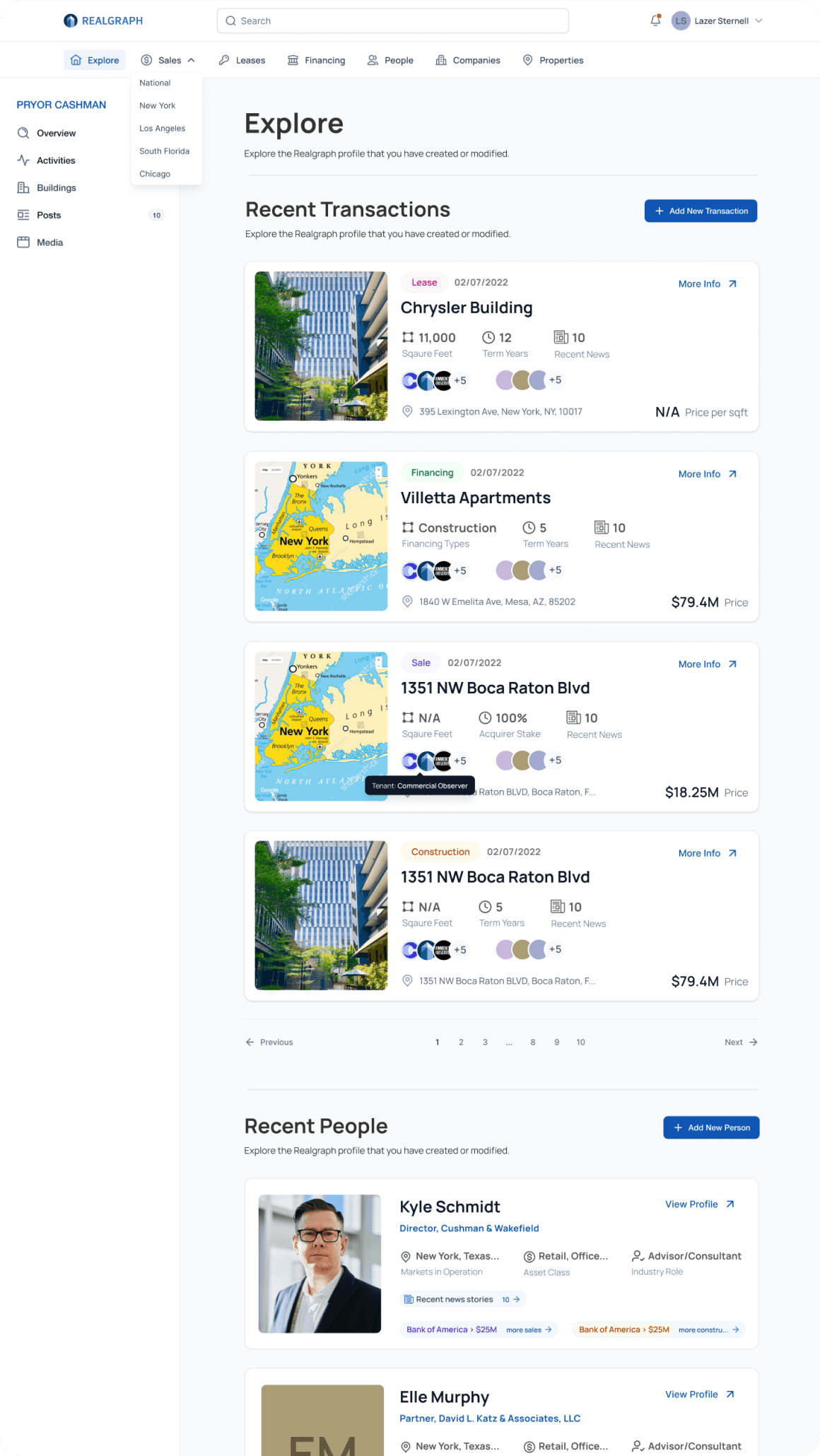
- I included a CTA, clear headlines, and larger photos. In order for users to quickly scan and locate the data they require, I also utilized a standard format for the cards.
- I added more information to the cards, I included metadata such as tags and categories.
- Users were unsure which cards belonged to certain taxonomies, so I added color coding to each taxonomy to make it easier for them to quickly identify the cards that apply to them.
- I also added iconography to quickly and efficiently express information, making it simpler for users to recognize relevant cards at a glance. Also, it improves the visual appeal and interest of the data cards, which will contribute to an increase in user interest and engagement.
Tile Design Option

Card Design Option
2. Press Release - PR Creation Flow and PR Detail Page



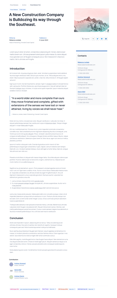


Goals
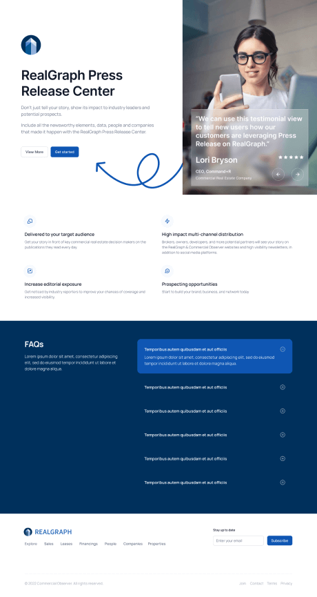
To design a user flow & professional press release styled page to guide users into the function of promoting their brand, while allowing more users to find transactions via Realgraph & search engines.

Hypothesis
With a well designed page and CTAs across the site, we'll see more user engagement with the feature, collect more data and generate additional traffic from search via new pages & content as well as cross-linking to related RG objects.
Solutions
- I made sure the press release creation flow is easy to understand and follow, with a clear step-by-step process. I also broke down the process into small, manageable steps, and provide users with clear guidance and feedback at each stage.
- I provided examples of successful press releases on the platform to inspire users and give them an idea of what they can achieve. This is to help to set expectations and guide users towards best practices.
- I used progress indicators to show users where they are in the press release creation process and how many steps are left. This is to help reduce user anxiety and increase their sense of control.
- I added a preview page to the flow to help users see how their press release will look like after submission.
- I provided alert messages that clearly define each field's purpose and add further context to the section. This will help to reduce frustration and increase the likelihood of successful press release creation.
- I also ensured that the press release creation flow is optimized for mobile devices, so that users can create and edit press releases on-the-go.
3. Advanced Search
Goal
Streamline the search experience and simplify how users find, filter and explore CRE information (activities, people, companies, properties)
Scope
- Use sitewide search results as starting point / template
- Filters/search options should not be hidden behind the widget/modal, include them on page so users can easily refine their search
- Include markets filter/search as well
- Use the legacy design direction, improve the UX and layout, use the dual-tier nav system
- Improved UI components will follow in optimization tickets
Solutions
- I introduced auto-suggestions to provide users with suggestions for their search terms based on popular searches or related keywords. This is to help speed up the search process and reduce errors.
- I Implemented a predictive search that suggests results as users type in their search terms. This is to help users find relevant results faster and with less effort.
- I introduced the option for users to filter their search results by various criteria, such as location, property type, size, and price. This will help users to refine their search and find the most relevant results.
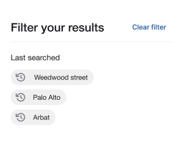
- I introduced a search history feature that allows users to easily revisit previous searches, refine them, and save them for future use.
- I Included auto-suggestions that appear as users type in their search terms. This is to help to suggest popular searches, misspellings, or related keywords to help users find what they're looking for faster.
Advanced Search
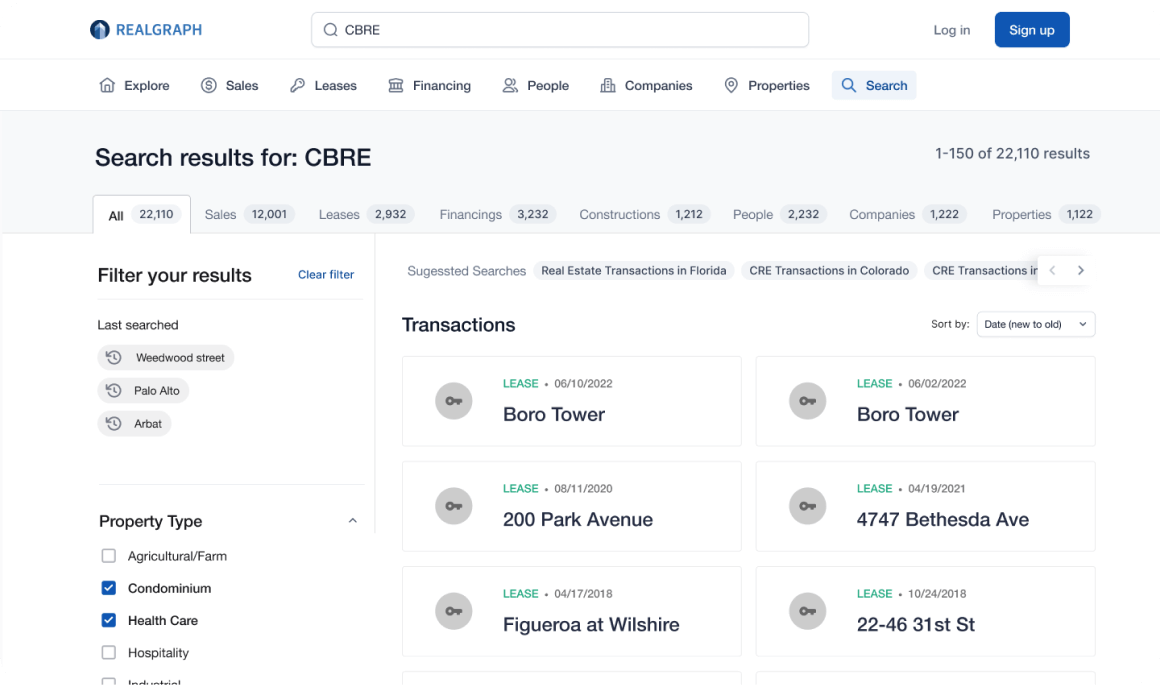
Advanced Search: Empty State
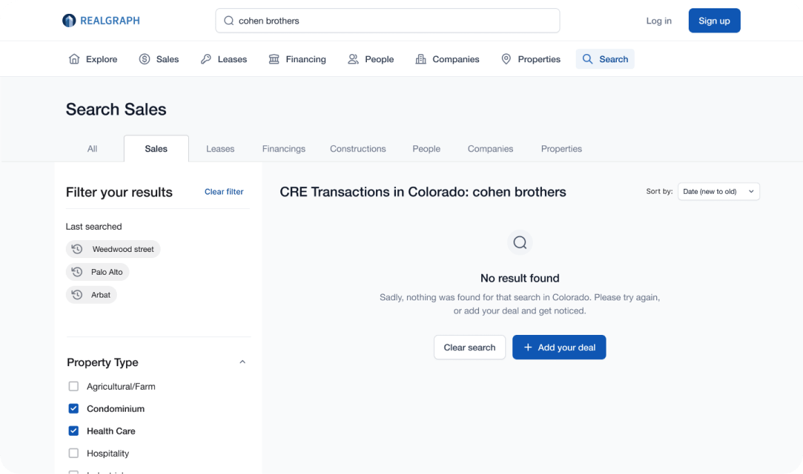
Search Filters


4. Account Creation Flow/Modals

Problem
After users signup, they're dropped into a big form to enter their information and then asked to contribute data – two big & overwhelming asks before they understand the value of the product. We also have no mechanism in place to link user accounts to existing people entities.
Goal
Make it easier for users to create an account, provide their information and enter the product to begin researching & contributing data.
- Improve registration flow in refined legacy design style
- Add feature to link user with people entity
- Improved value prop text & CTAs to engage users
Solutions
- I made the account creation form as simple as possible, you only need your email address and password to create an account. This will help to reduce friction and increase the likelihood of successful account creation.
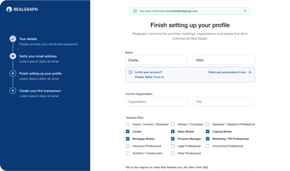
- I used progress indicators to show users where they are in the account creation process and how many steps are left. This is to help reduce user anxiety and increase their sense of control.
- I provided alert messages that clearly define each field's purpose and add further context to the section. This will help to reduce frustration and increase the likelihood of successful account creation.
- I allowed users to customize their account settings, such as their industry role, contact information, and regions and cities of interest. This will help to increase user engagement and satisfaction.
- Because the algorithm can recommend an account with a first and last name that is similar to the user's, I also gave users the chance to quickly claim and personalize an account.
Create Realgraph account

Email address verification

Finish setting up your profile
Create your first transaction

Measuring Success
- Design for both sides of the market: Realgraph connects both industry professionals and businesses. I learned that it was important to design for the needs of both sides of the market and create a balanced platform that provides value for both.
- Keep the user experience simple: Commercial real estate can be complex, so it was important to keep the platform user-friendly and simple to navigate. I focused on streamlining the user experience to make it easy for users to find what they need and take action.
- Iterate based on user feedback: I learned that it's important to continually iterate on the platform based on user feedback. By listening to the users and making changes based on their needs and preferences, I was able to improve the platform and create a better overall user experience.
- Build trust: In the commercial real estate industry, trust is crucial. I designed Realgraph to include features that build trust between users, such as a transparent rating system and verified user profiles.
Overall, designing Realgraph taught me the importance of identifying pain points, designing for both sides of the market, keeping the user experience simple, iterating based on user feedback, and building trust in the platform.
Learnings and Conclusion
Lead Product Designer
My Role
UX/UI Design System Product Strategy
Responsibilities
Observer Holdings LLC
Company
Real Estate
Industry